
Understanding COVID By Age — A Better Way

A recent Seattle Times article detailing the age aspect of COVID showed what proportion of COVID cases were happening by age group over time — something like this:
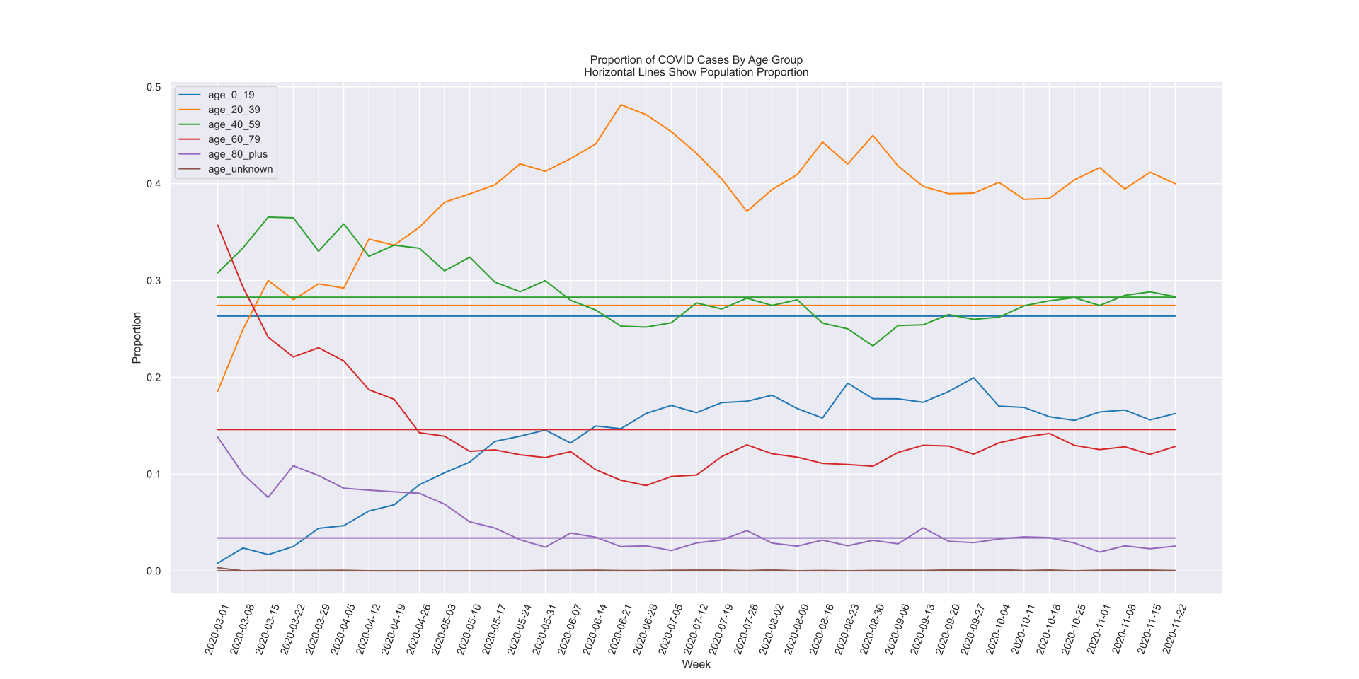
This is a great example of something I call data without insight. Yes, directly, folks aged 20–39 account for 40% of COVID cases as of late — but if folks aged 20–39 account for 40% of the population, is that really an interesting stat?
This is another case where a simple and effective baseline can really bring life to your data. When we add that additional datapoint and frame the data in the context of the baseline, we get this plot, where you can directly see that yes, absolutely the 20–39 age group is punching above its weight in terms of COVID prevalence:
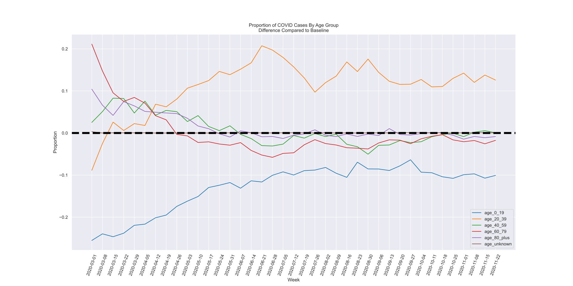
As a bonus, you get additional insight: the 0–19 age group is well below expectation, which isn't clear from the original plot. This is extremely important for everyone to both understand the current state of COVID and see how it can change in the future.
Check out my analysis to see how easy it is to reshape the data for much better insight. This is just one of many ways I can help you turn your data into action.
Contact me to find out more about how Effective Data Consulting can transform your business via this technique and many others.